Each of these pages will show a creative use of the sketch, may include the monthly TIP & TRICK and of course possess incredible artistic talent. Where possible I have added links to each image so if you would like to see more of the artists work simply click on their pages to be redirected to their blogs or most current gallery. It would be great if you could leave them some love and say we sent you... he he!
If your page has been showcased here you are welcome to grab the GSO Eye Candy Badge
to pop on your blog sidebar. Below you can see two sizes to choose from.
To grab it simply pick the size you want then drag and drop it onto your desktop or
alternatively right click and 'Save As' to your desktop.
Okay so lets get onto the fun stuff have a look at Page Drafts Gallery Standout selections for April...
Mary's use of bold papers and bright palette is a fun way to add texture and colour. Scattering smaller elements likes beads adds another point of interest and movement to a page. Such an amazing digital page worthy of a mention!

to pop on your blog sidebar. Below you can see two sizes to choose from.
125px wide 180px wide
To grab it simply pick the size you want then drag and drop it onto your desktop or
alternatively right click and 'Save As' to your desktop.
Okay so lets get onto the fun stuff have a look at Page Drafts Gallery Standout selections for April...
'PDA ugh'

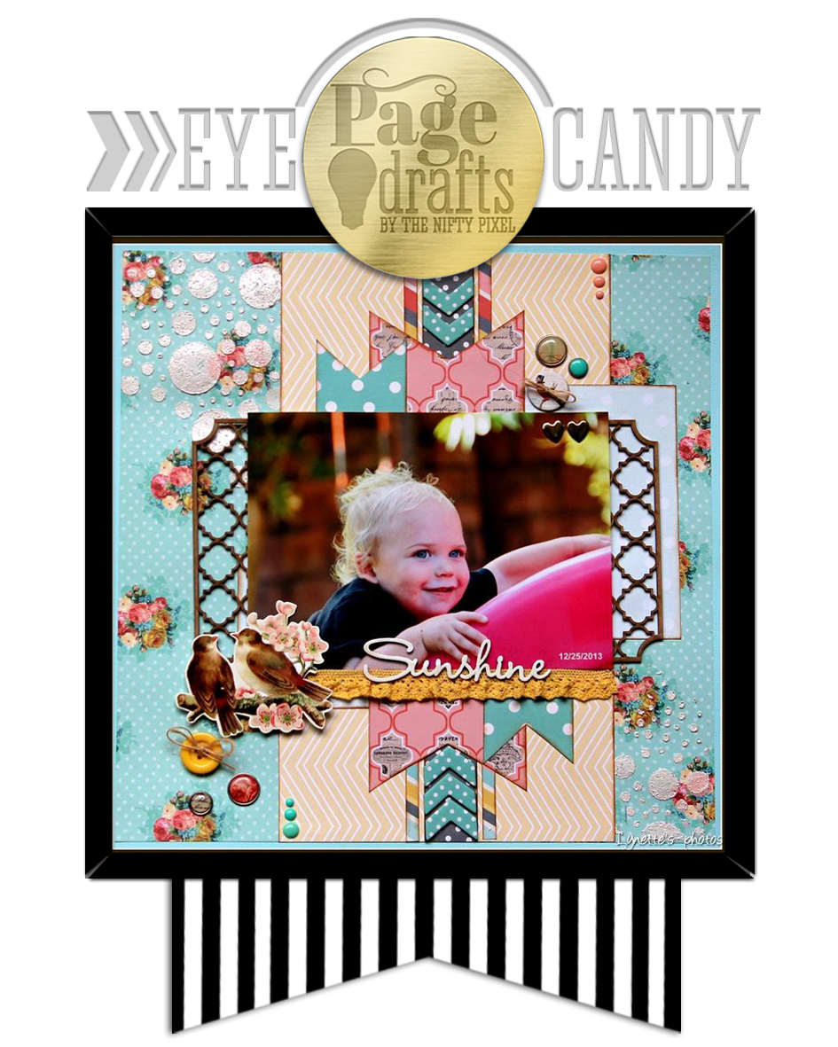
'Sunshine'
I love Lynette's mix of patterned papers. They are a perfect choice for this fun outdoors photo. Lynette has echoed the dot texture by clustering some buttons and brads which is a clever way to introduce a subtle unity in the design. This is such a fun and vibrant page!
'Carry On'
Heather has followed the sketch almost to a tee but still maintained a very unique page. Including speech bubbles is a great way to add some whimsy and pairing them with the selfie snapshot is lots of fun! This clean page with just a touch of grunge is a perfect example of how to add a little bit of painterly texture without over doing it. Such a fun page!
'Solana Sunset'
by Carrie Shirley Randolph
Page Drafts Template #25.2
Shirley has created a beautiful and dreamy page. Using two different sized photos is a clever way to draw the viewer into the scene and make the photo stand out. Using strips of paper in your project is another great way to use up some scrap papers or utelise most of the paper designs in one digital kit.
I love the simple elegance of this page.
'How Many?'
by Shawna Saucier
Page Drafts Template for CSI #114
The great thing with sketches is you can rotate them and get a completely different design. Shawna has done that with this sketch perfectly. Another great trick to draw the eye into the main grouping or photo is to add directional elements like Shawna has done with the chevrons. She has reinforced that by pooling most of the colour in the photo and in the directly adjacent elements. Such an eyecatching page!
I hope everyone enjoyed viewing these jaw-droppingly beautiful artworks.
Keep an eye out for next months GSO which will be mid May you never know it could be YOU!
Have a fabulous day and congratulations Lynette, Carrie, Heather, Shawna and Mary, all your pages are sheer perfection!
Page Drafts Template for CSI #114
The great thing with sketches is you can rotate them and get a completely different design. Shawna has done that with this sketch perfectly. Another great trick to draw the eye into the main grouping or photo is to add directional elements like Shawna has done with the chevrons. She has reinforced that by pooling most of the colour in the photo and in the directly adjacent elements. Such an eyecatching page!
Keep an eye out for next months GSO which will be mid May you never know it could be YOU!
Have a fabulous day and congratulations Lynette, Carrie, Heather, Shawna and Mary, all your pages are sheer perfection!


Beautiful pages ladies!
ReplyDeletewow wow wow what amazing work displayed here , so inspiring and so beautiful arty and magical xoox
ReplyDeletehey Em, just been having a browse through your posts , so inspiring and fabulous , keep em coming xoxoo
ReplyDeletelove all the inspiration-glad I found you via way of a post on facebook tonight!
ReplyDeleteBeautiful layouts... :D
ReplyDeleteThanks for the shout out. I love working with your sketches.
ReplyDelete